
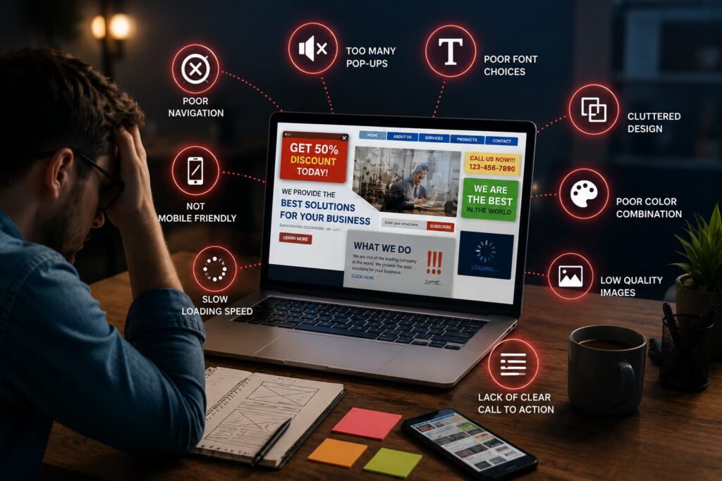

Imagine walking into a shop in Mumbai where the lights are flickering, the shelves are dusty, and the staff ignores you. You would likely turn around and leave immediately. Your online presence works the same way for your business.
Many entrepreneurs in India lose potential revenue because their digital storefronts feel cluttered or confusing. These Website Design Mistakes often go unnoticed by owners, yet they act as invisible barriers to growth. If your pages load slowly or look broken on mobile phones, visitors will quickly find a competitor who offers a smoother experience.
First impressions are everything in the digital world. By applying professional website design tips, you can transform your platform into a powerful tool that builds trust and drives sales. Let us explore how to identify and fix the common errors that might be holding your brand back from true success.
Key Takeaways
- Poor digital aesthetics can drive away potential clients before they engage with your services.
- Mobile responsiveness is essential for capturing the growing Indian online market.
- Slow loading speeds act as a major barrier to customer retention and business growth.
- Professional layouts help build immediate trust with your target audience.
- Identifying and fixing common errors ensures your online presence remains competitive.
Slow Website Loading Speed and Performance Issues
A slow website can make visitors leave before they see your products. When pages don’t load fast, it’s a bad experience. This can hurt your chances of making sales.

Identifying bottlenecks in your server response time
A fast site starts with quick server responses. Slow servers or bad database queries can cause delays. Check your Time to First Byte (TTFB) to find these problems.
Looking at server logs can show if your hosting is too small. Upgrading or optimizing your database can fix these issues. This is key to making your site load faster.
Optimizing image assets for faster rendering
Big, unoptimized images slow down your site. Using high-resolution files without optimizing is a mistake. Use WebP and lazy loading to only load images when needed.
Compressing media files makes your site lighter without losing quality. This is a simple way to keep your site fast. Remember, ignoring these details can make mobile users unhappy.
Leveraging browser caching and content delivery networks
Caching stores temporary page versions on devices. This means visitors don’t have to download everything again. Set expiration times for static resources on your server.
Using a Content Delivery Network (CDN) also helps. It spreads your content across servers worldwide. This makes your site faster for everyone, no matter where they are.
Lack of Responsive Website Design for Mobile Users
In India, mobile use is huge. Your website needs to be mobile-friendly to succeed. A responsive website design is key. If it doesn’t work on small screens, you’ll miss out on many customers.
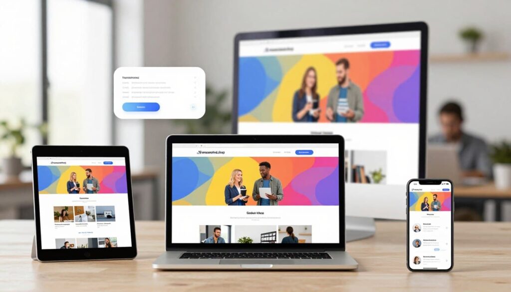
A mobile-friendly website is more than looks. It’s about working well and being easy to use. If your site looks bad on a phone, people won’t trust you. They might go to a competitor instead.
Testing your layout across various screen sizes
Just because it looks good on your computer doesn’t mean it will everywhere. You need to test it on different devices. Here’s how to check:
- Use browser tools to see how it looks on different screens.
- Test it on real phones and tablets.
- Make sure users can scroll without having to move their phone.
Prioritizing touch-friendly navigation elements
People use their fingers on phones, not a mouse. If your buttons are hard to tap, it’s frustrating. Make sure everything you want people to click on is big enough.
“Design is not just what it looks like and feels like. Design is how it works.”
Steve Jobs
Think about the space between menu items and buttons. A mobile-friendly website needs lots of room. This makes it easier to use on the go.
Avoiding intrusive pop-ups on mobile devices
Full-screen pop-ups are a big no-no on phones. They cover everything and make it hard to find a way to close them. This can make people leave your site fast.
If you must have pop-ups, make them non-intrusive and easy to close. They should never get in the way of your content. This helps keep your visitors happy and interested.
Complex and Confusing Website Navigation
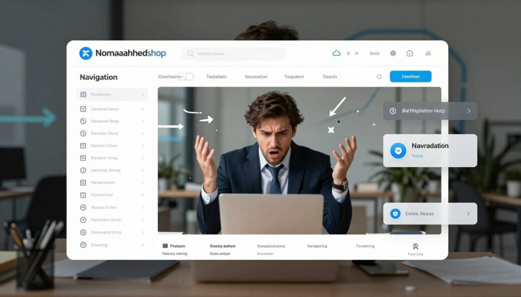
A disorganized menu is a classic sign of bad website design that frustrates your potential customers. When visitors land on your page, they expect an easy path to the information they need. If your website navigation is cluttered or illogical, users will likely leave your site for a smoother experience elsewhere.
Implementing a logical hierarchy for your menu
Your menu should be a clear roadmap for your visitors. Start by grouping related pages under broad, high-level categories to avoid overwhelming the user. A logical hierarchy makes it easy for even first-time visitors to find what they need without guessing.
“Good design is obvious. Great design is transparent.”
Joe Sparano
Using descriptive labels to guide user intent
Avoid using overly creative or vague terms in your menu items. Instead, use descriptive labels that clearly tell users what they will find upon clicking. For example, use “Our Services” or “Contact Us” instead of abstract terms like “Our Journey” or “Connect.” This clarity helps guide user intent and significantly reduces the time spent searching for content.
Adding a functional search bar for quick access
Even with a perfect menu, some users prefer to type exactly what they are looking for. Adding a functional search bar provides a critical safety net for these visitors. This feature is essential for larger sites where browsing through multiple sub-menus might feel tedious or inefficient.
The following table highlights how different navigation elements impact the overall user experience on your site:
| Navigation Feature | User Benefit | Impact on Conversion |
|---|---|---|
| Logical Hierarchy | Reduces cognitive load | High |
| Descriptive Labels | Improves clarity | Medium |
| Search Bar | Provides direct access | High |
By refining your website navigation, you eliminate the friction that often stems from bad website design. Prioritizing these simple structural changes will help you keep visitors engaged and move them closer to a final purchase decision.
Poor Website Conversion Optimization Strategies
Turning casual browsers into paying clients is more than just looks. It needs a clear plan for user behavior. A beautiful site is useless if it doesn’t turn visitors into leads. That’s why website conversion strategies are key for your business to grow.

Placing clear and compelling calls to action
Your visitors need clear guidance on what to do next. If your call to action (CTA) is hidden or vague, you lose potential sales. Use action-oriented language like “Get Your Free Quote” or “Start Your Trial Today” to create a sense of urgency and clarity.
Reducing friction in your checkout or inquiry forms
Complexity is the enemy of progress. When your forms ask for too much information, users often abandon the process entirely. Keep your fields to the absolute minimum to ensure a smooth website conversion journey for every visitor.
“The goal of a landing page is to get the visitor to take one specific action. If you give them too many choices, they will likely choose none.”
— Conversion Optimization Expert
Using A/B testing to refine your landing pages
Data-driven insights are far more reliable than guesswork. By running A/B tests, you can compare two versions of a page to see which one performs better. This iterative process allows you to refine your layout based on how real people interact with your content.
| Feature | High-Converting Site | Low-Converting Site |
|---|---|---|
| CTA Visibility | High contrast, above the fold | Hidden or blended into background |
| Form Length | 3-4 essential fields | 10+ unnecessary fields |
| Testing Strategy | Continuous A/B testing | No testing performed |
Inconsistent Branding and Visual Design
A disjointed visual style can quickly turn away potential clients who value professionalism. When your site lacks a cohesive look, visitors often struggle to connect with your brand identity. Implementing smart website design tips helps you avoid these common pitfalls and keeps your audience engaged.
Maintaining a unified color palette and typography
Your color scheme and font choices serve as the visual language of your business. Using too many colors or conflicting typefaces creates confusion and dilutes your message. Consistency is the key to ensuring that every page feels like part of the same experience.
Stick to a primary color palette of two or three shades that reflect your brand personality. Pair these with a clean, readable font hierarchy to guide the user’s eye effectively. These website design tips ensure that your site remains visually balanced across all devices.
Ensuring your logo and messaging align with your values
Your logo is the face of your company, and it must appear clearly on every page. If your visual branding contradicts your written mission, you create a sense of distrust. Ensure that your tone of voice matches the style of your graphics to maintain a unified identity.
Place your logo in a consistent location, typically the top-left corner.
Use high-resolution assets to prevent pixelation or blurriness.
Align your taglines with the core values displayed in your visual elements.
Creating a professional aesthetic that builds trust
A polished, professional aesthetic signals to your customers that you are reliable and detail-oriented. When your design elements work in harmony, you reduce cognitive load and improve user satisfaction. This approach is one of the most effective website design tips for driving long-term loyalty.
Design Element Consistent Approach Inconsistent Approach
Color Palette Limited to 3 core colors Random colors per page
Typography Standardized font family Multiple clashing styles
Logo Usage Clear, high-quality placement Distorted or missing
Visual Tone Professional and uniform Chaotic and mismatched
Ignoring Essential Website User Experience Principles
Many businesses lose potential customers because they ignore basic website rules. Neglecting website user experience can lead to high bounce rates and lower conversions. A good ux design makes sure visitors find what they need easily.
Improving readability through proper contrast and spacing
Readability is key for a good online experience. If text is hard to read, users will leave quickly. Use high-contrast colors to make your content stand out.
White space is also crucial for keeping visitors interested. Give your text and images room to avoid overwhelming the page. Simple changes can make a big difference in readability:
Use a font size of at least 16px for body text.
Maintain a line height that prevents text from looking crowded.
Ensure your text color provides a clear contrast against the background.
Ensuring accessibility for users with disabilities
Modern ux design must be inclusive. You must make your site accessible to everyone, including those with disabilities. Ignoring these standards can lose you a lot of potential customers.
Adding accessibility features is smart and responsible. It makes your site better for everyone, not just those with disabilities. Always provide alternative text for images and ensure your navigation works well with keyboard commands.
Reducing cognitive load by simplifying page layouts
Your visitors should easily understand your message. A cluttered page with too many choices or animations is overwhelming. Simplify your design to help users process information quickly.
Go for a clean, simple look that directs the eye to your main content. Removing unnecessary elements helps your audience focus on your value. A simple layout keeps visitors moving through your sales funnel smoothly.
Weak Content Strategy and Lack of Value
A weak content strategy can block your audience from connecting with your brand. Content is key to your online presence. Without a solid plan, you miss the mark on what your customers want. It’s crucial to improve your strategy for growth and better ux design.
Writing clear headlines that address customer pain points
Your headlines grab attention first. If they don’t solve a problem, people might leave for another site. Effective headlines are short, focused on benefits, and from the reader’s point of view.
Instead of vague titles, show how you solve problems. Talking directly to your customers’ challenges in India boosts your credibility. This clarity helps users navigate your site with purpose.
Using high-quality visuals to support your text
Text alone can’t hold a visitor’s interest. High-quality visuals like infographics or photos make text easier to read. These elements are key for a ux design that keeps users engaged.
Images should have a purpose, not just fill space. When they match your text, they reinforce your brand and simplify complex info. Thoughtful imagery adds a professional touch that builds trust.
Updating your content regularly to stay relevant
The digital world changes fast, and outdated info can harm your reputation. Regular updates keep your data current and useful. This keeps your audience informed and signals to search engines that your site is alive.
To stay on top in your field, you need to keep adding new insights. Regularly bringing fresh content encourages visitors to come back. Use the table below to check how your content strategy stacks up.
Strategy Element Ineffective Approach Effective Approach
Headlines Vague and generic Problem-solving and specific
Visuals Stock photos without context Custom graphics supporting text
Updates Set and forget Scheduled content reviews
Value Focus on self-promotion Focus on user needs
Hidden Contact Information and Trust Signals
Your website is like a digital store. Hiding your contact info is like locking the door. When people can’t find you, they might think you’re not transparent or supportive. It’s important to make communication clear for a good website user experience.
Making your contact details easily discoverable
Put your contact info in places where people usually look, like the header or footer. Having a “Contact Us” page is good, but it shouldn’t be the only place. Consistency makes help easy to find.
Adding a live chat or simple form makes talking to you easy. This shows you value your customers’ time and opinions. It also makes you look more professional.
Displaying customer testimonials and social proof
People often want to see what others say before they decide. Real customer testimonials are key to winning trust. Show these on your homepage or near buttons to act.
Sharing success stories or case studies creates an emotional bond. Seeing others’ positive experiences makes people more confident in yours. This boosts your website user experience and helps you sell more.
Adding security badges to reassure your visitors
Today, people are careful about sharing info online. Security badges, like SSL certificates, show you care about their safety. These badges mean you’re serious about protecting their data.
Feeling safe makes people more likely to buy or contact you. Trust is crucial for online success. Here’s how different trust signals help your site:
Trust Signal Primary Benefit Impact on User
Contact Details Accessibility Reduces anxiety
Customer Reviews Social Proof Builds confidence
Security Badges Data Protection Increases safety perception
Professional Design Brand Authority Enhances credibility
Common Website Design mistakes that hinder SEO
Search engines are like the guards of your website traffic. Some design mistakes can keep them out. These errors can hide your business from potential customers. Fixing these issues makes your website more visible and competitive.
Optimizing meta tags and header structures
Meta tags and header structures guide search engine crawlers. Without clear title tags or proper H1 to H6 hierarchy, search engines get lost. Clear, keyword-rich headers help them understand your content’s context, boosting your ranking.
Make sure each page has a unique meta description to attract clicks. Logical headers make it easy for both users and bots to understand your content. This builds a strong foundation for your search engine performance.
Fixing broken links and 404 error pages
Broken links and 404 error pages are like dead ends. They frustrate visitors and show poor site maintenance. Search engine crawlers waste time on broken links, not indexing your active content. Regularly checking for these errors is crucial.
Use custom 404 pages to guide visitors back to your main navigation. This keeps them on your site longer and lowers bounce rates. Fixing these issues shows search algorithms your site is reliable and well-maintained.
Ensuring your site architecture is crawlable by search engines
A well-organized site architecture is key for a successful, mobile-friendly website. Deep navigation or disorganized internal linking can hinder crawlers. Make sure your site map is updated and internal links work.
A clean, flat structure helps search engines index your content well. This is crucial for a high-performing mobile-friendly website in today’s market. Avoiding complex Website Design mistakes in your architecture keeps your business accessible to all users, no matter their device.
Conclusion
Your website is like a digital storefront for your brand. Small design flaws can stop people from using your services.
Fixing these common mistakes can make your site better and increase sales. You’ll stand out by making sure your site works well on all devices.
Keeping your site up to date keeps you ahead in a quick-changing market. Your visitors expect a smooth, professional, and easy-to-use online space every time.
Start by checking your website layout today. Find out which parts need your focus to help your business grow. Making small changes now can help your success in the future.
FAQ
How do common website design mistakes affect my business growth?
Bad website design can make a bad first impression. This might scare off potential clients before they even get to know you. In India’s competitive market, ignoring expert design tips can lead to losing customers to better-looking sites.
What are the most effective ways to improve my website loading speed?
To speed up your site, look for server problems and make images load faster. Use Cloudflare for faster content delivery and browser caching to cut down on wait times. This ensures your site loads quickly for everyone.
Why is responsive website design essential for reaching mobile users?
Most internet users are on smartphones. Responsive design makes sure your site works well on all devices. A good mobile site is easy to use and keeps visitors happy, not frustrated.
How can I fix confusing website navigation to keep visitors on my site?
Make your site easy to navigate by organizing menus well and using clear labels. A search bar helps users find what they need fast. This keeps them from leaving your site.
What strategies should I implement for better website conversion?
To improve conversions, use clear calls to action and make forms easy to fill out. Test your landing pages to see what works best. This turns more visitors into loyal customers.
How does professional ux design build trust with my audience?
Good ux design makes your site easy to read and accessible. It also shows you care about details. This makes your brand seem reliable and trustworthy.
What are the primary signs of bad website design that I should avoid?
Bad design includes slow sites, hidden contact info, and mixed branding. Without social proof or security badges, visitors might doubt your site. They might choose a more open competitor instead.
How do design choices impact my website’s SEO and search visibility?
Poor design can hurt your SEO by making it hard for search engines to find your content. To stay visible, optimize meta tags, fix broken pages, and make sure your site is easy for search engines to crawl. These steps are key to a strong online presence.